Add Rooms To Your Life
Where do good ideas come from? This was the question Steven Johnson took four years to explore. And then distill his findings into an aptly named book: Where Good Ideas Come From.

The main takeaway, one that I recite just about once a month to the team, to myself, or to customers, is that of the “adjacent possible.” Opening doors.
The argument can be summarized in one sentence: at any given moment, there isare a set of ideas, inventions, or opportunities that are just one step away from what currently exists.
Ideas don’t just happen as lightbulb moments: they happen gradually as new steps reveal themselves.
Here’s an example:
Started with landline ->
Moved to mobile chips and batteries ->
That led to your cool flip phone ->
That led to smartphones ->
App stores: there’s an app for that ->
Ride-sharing revolution. You can now DoorDash a vanilla latte.
Travis Kalineck (Uber Founder) couldn’t go from landline to Uber. Too many rooms in between.
There were steps.
Doors to open.
Rooms to explore.
How do you harness the power of the adjacent possible? It’s simple. Open doors.
If you want to advance your career and innovate in your field, you need to ask yourself: Am I opening doors to the connecting rooms? The areas in my profession that are unknown to me and to most. Am I exploring the adjacent possible?
My goal was and still is to open doors. To operate a company on the frontiers.
Where do good ideas come from? Assuming GeoFli (change website content based on visitor location) is a good idea, the path to landing on the idea came from doing exactly this.
Here are the rooms I had to enter.
Enrollment marketing -> college fair circuit (think trade show marketing)-> digital marketing -> conversion rate optimization -> landing page builders -> personalized website traffic based on location.
Pintler Group has a core value to operate on frontiers. Another way of thinking about this: continue to open doors to rooms that didn’t exist three years ago. Or sometimes three months ago.
How to Find a Competitive Advantage:
Here’s the secret. The deeper you go and the more doors you open, the less crowded the rooms.
When you start in a career, you don’t know much. So all you can do is open doors and explore rooms. This is called gaining experience. A lot of people stop exploring. The key is to keep going.
Open doors to uncrowded rooms. This is your competitive advantage.
If the Room is Empty:
It applies to any career, passion, or area of expertise. In entrepreneurship, when I get to a room that doesn’t have a lot of people, the hair on the back of my neck stands up. It can mean a couple of things:
1. There’s actually not much happening. It smells of a college party that happened two days ago. The room used to be full. The party happened. Then ended. Think typewriter mechanics. Empty room. Not a lot of opportunity.
You could still be the best in the world in this room if that’s something that interests you. Typewriter repairman, for example.
2. You’ve actually skipped a couple of rooms. It feels empty because you’re lost. You haven’t spent enough time mastering Google Analytics and creating your own dashboards to know that it’s a solved problem. You’re in a room to build a dashboard that combines Google Ads and Meta Ads without having spent time in Data Studio (which does exactly this). Google owns this room and kicked everyone else out.
3. There’s a blue ocean here. You’ve found something that worked. There are still doors to open, but you’ve got a gut feeling there’s something here. The adjacent possible is on a frontier. And now I’m finding doors that have to be jarred open. Sometimes with a hard pull. Other times with a crowbar.
Think: building a new software to solve a pain point and combining industry knowledge with business acumen.
How this applies to building a business:
Innovate. I grew up in Rochester, NY. When I was born, the company that employed half of Rochester, Kodak, wasn’t based in Rochester: it was Rochester.
From 60,000 employees to 1,200 today (OG hipsters still use film). That leaves an impression on an entrepreneur.
When I moved to Montana and went to business school, at least three times a semester Kodak made its way into a case study, discussion or guest lecture on what NOT to do. It made books about combating complacency really fascinating to me.
The coolest part: the floor plan to explore rooms is friggin’ enormous. Like infinitely big. The AI rooms are filling rapidly. What if you do a 180? Turn around and go the other direction like this crossing guard in Burlington who makes 17k/month sending postcards. Snail mail? Really? Open the analog door. There might be some room.
How this applies to ambition:
You can be the one and only at something. The best in the world. Just keep opening doors until you’re the only one left in the room. Even if the last room is geography-based: “in Montana,” or “in my county,” or “in my school.”
How this applies to risk:
It took Alex Honnold ten years to free solo El Capitan. Started in a climbing gym. Then granite. His comfort zone expanded as he opened more doors. The adjacent possible grew. He free soloed a 100-foot wall. Then a 200 ft wall. Then familiarized himself with hundreds of routes in Yosemite. Lived in a van at the base of his objective. Expand. Expand. Expand. Until the next room was to free solo 3,000 vertical feet.
You don’t have to start a business or climb 3,000 feet without ropes. But your next good idea isn’t found in your current room. The best part? It’s highly adjacently possible that you’re a couple of doors away from an incredible career/entrepreneurial breakthrough.



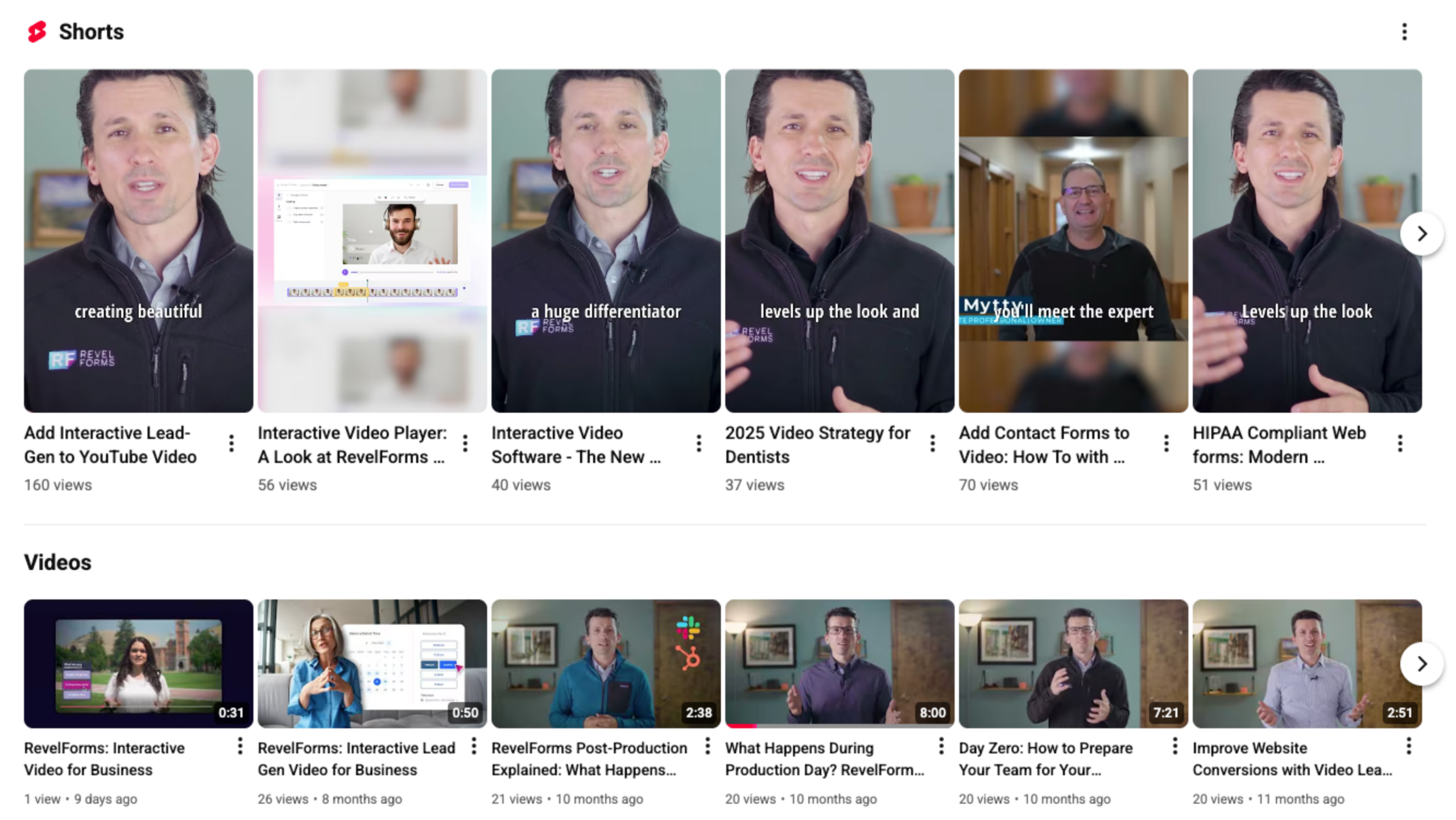 *Example of RevelForms YouTube page*
 *Shown above is our very own Ana attending Spryng by Wynter conference in Texas*